




Bloggers Council
Connecting creators, brands, and digital expertise

About the Project
Bloggers Council brings together creators, brands, and digital services. The website introduces the organisation and brings its people, services, and projects into one place.
Visitors can explore what the Council offers, browse its work, meet the community, or start with a specific question. Separate pages provide more detail without overloading the homepage.

Task
The challenge was to make several different activities feel like parts of the same organisation. Creator promotion, blogger tours, channel growth, and digital development needed a clear structure and a shared visual identity.
The website also had to balance an expressive first impression with practical navigation, helping visitors understand what the Council offers and where to go next.
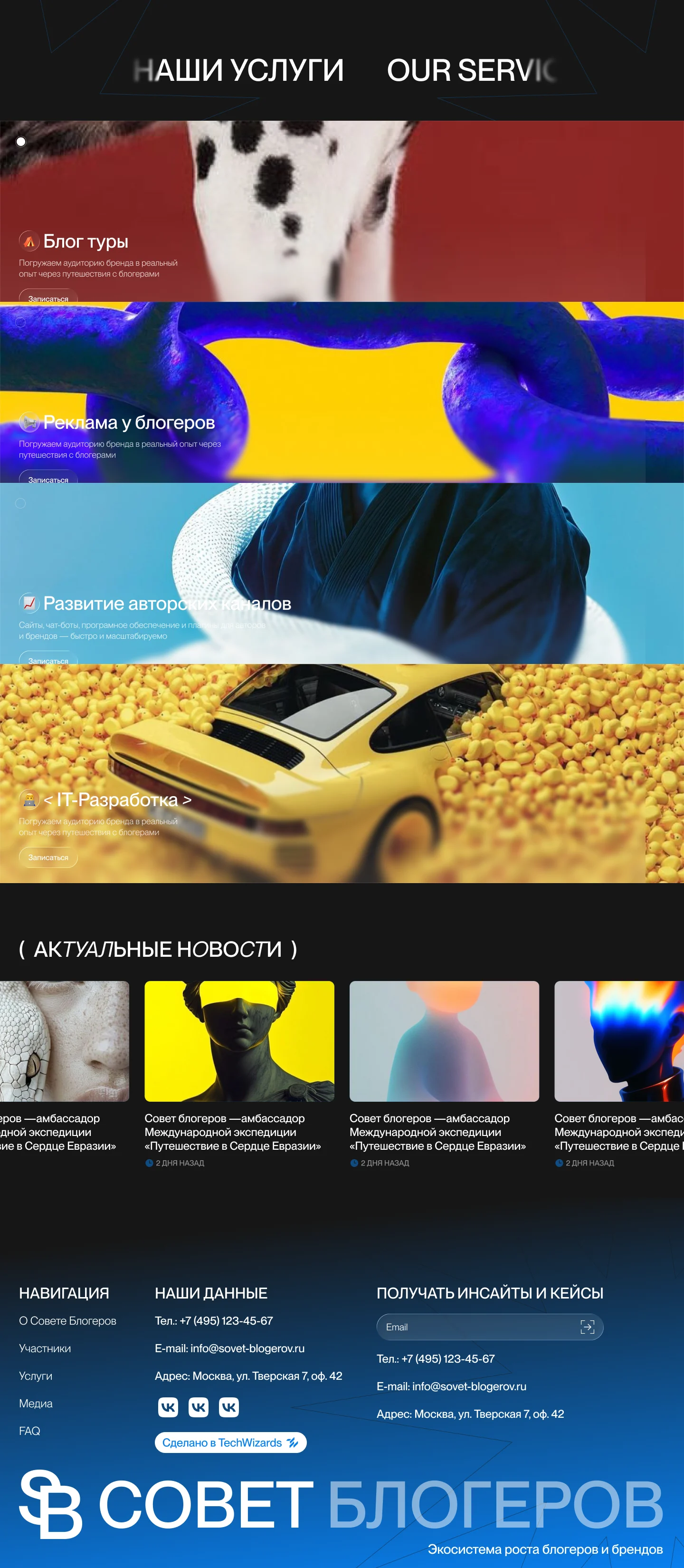
Visual Language
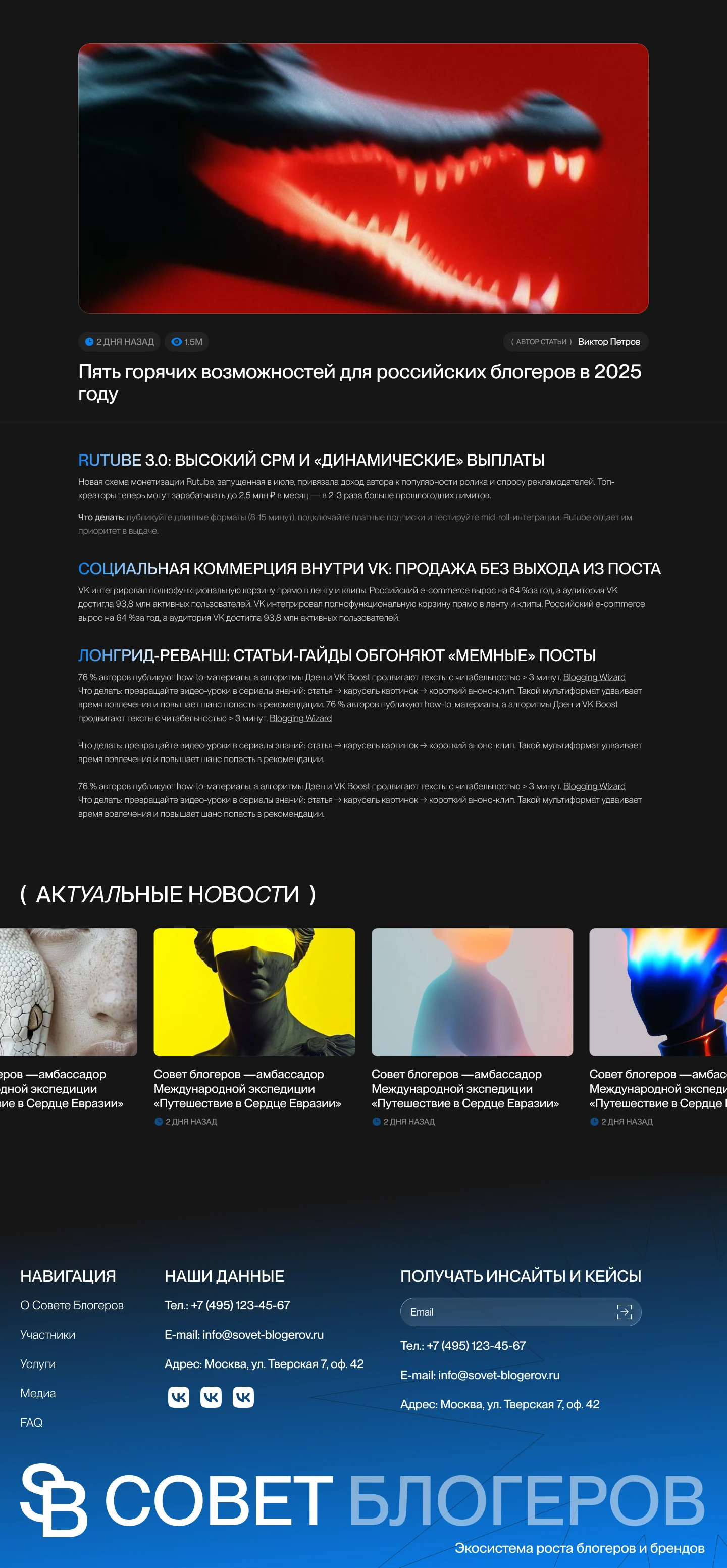
Large photography, oversized typography, and blue light effects give the website a strong editorial character. Clean sans-serif text is paired with italic serif accents, while a visible grid connects the different sections.
Dark backgrounds frame the main story; lighter pages give project content more space. A compact floating navigation bar stays available as visitors move through the site.
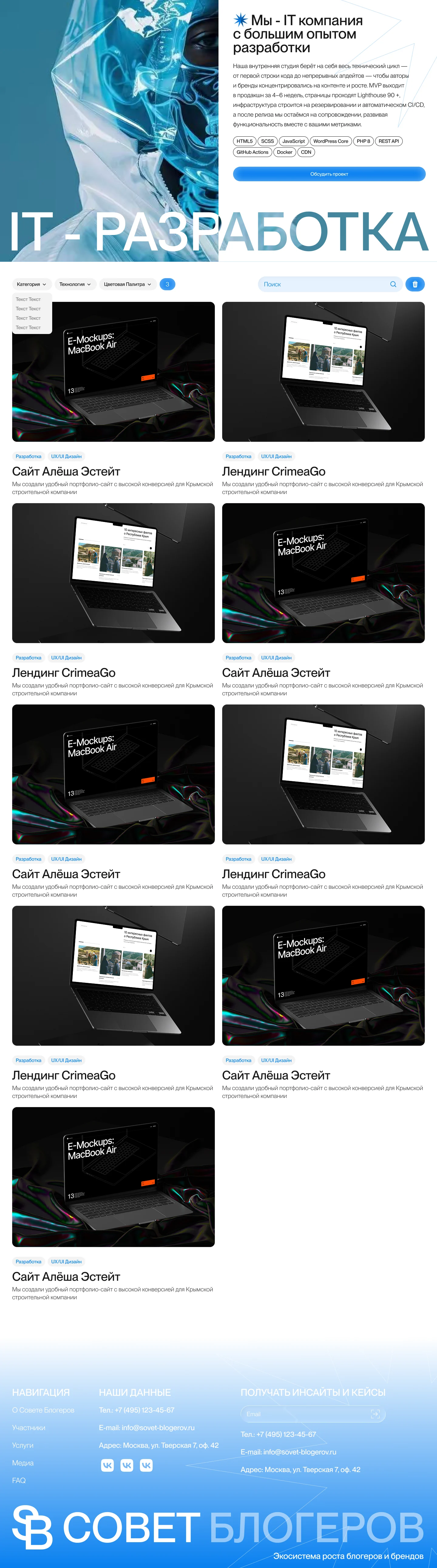
Services and Projects
Service cards introduce the Council’s main areas of work and lead into a shared project catalogue. Category and technology filters, supported by search, let visitors narrow the list before opening a project.
This connects the service overview with the work presented on the site. Visitors can move from a broad area of interest to a more focused selection of projects.
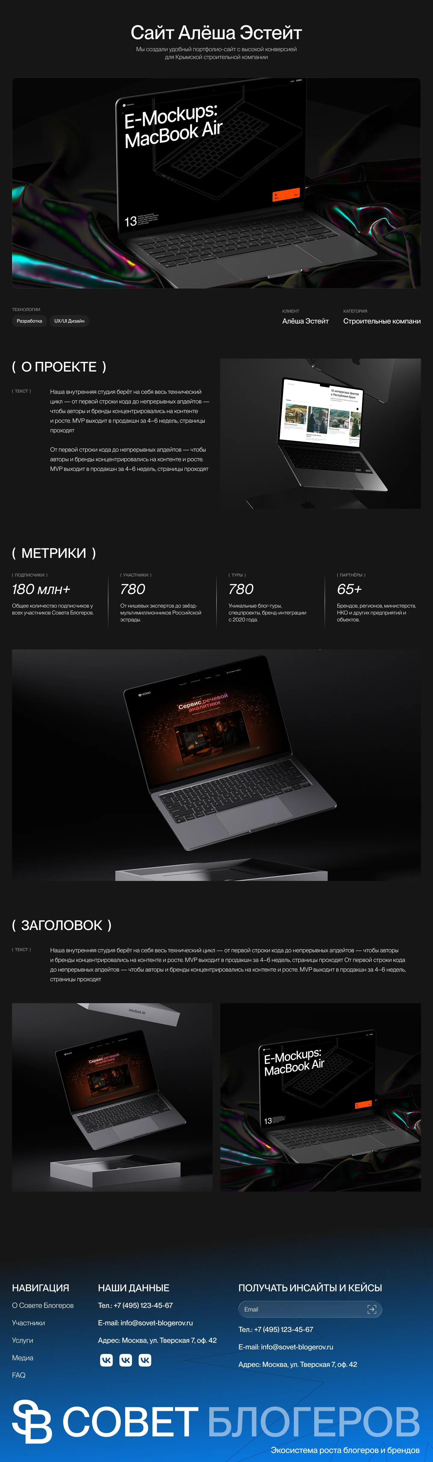
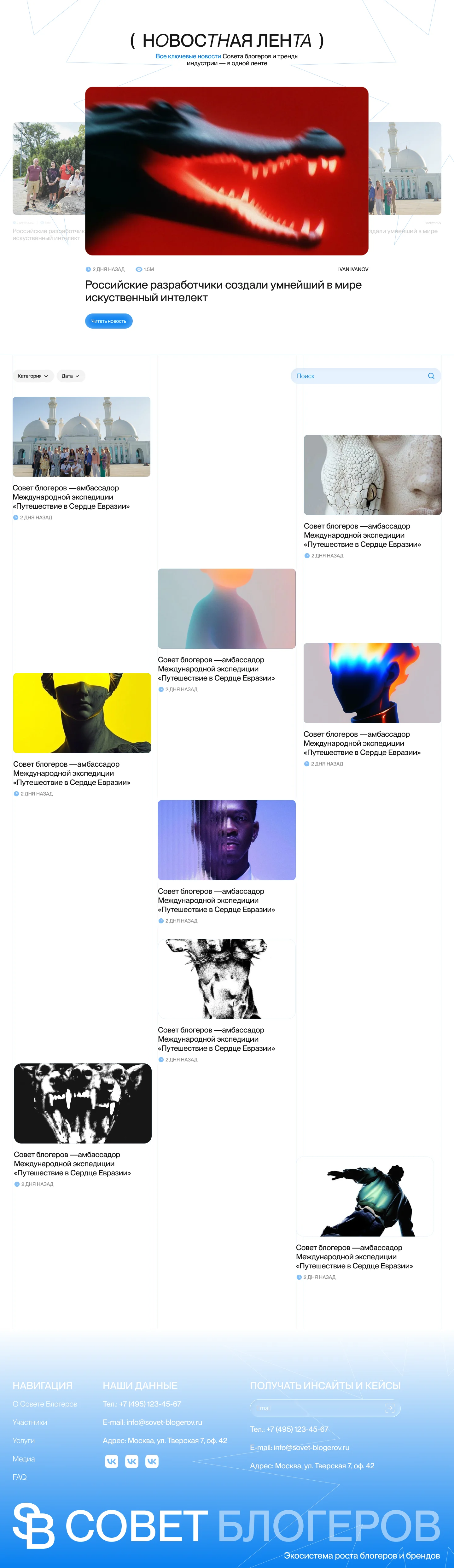
Starting with a Question
An interactive cloud of topics offers another way to explore the Council’s services. Visitors can start with a familiar need, such as building a website or developing a business.
Selecting a topic opens a compact card with a description of the need, a proposed solution, and a link to take the next step. This connects the range of services to the visitor’s own goals.




Summary
The result is a multipage website that connects the Council’s identity with clear ways to explore its work and community.
A shared visual language carries across the homepage, services, project catalogue, and member pages. Focused interactions help visitors move from an initial question to a relevant next step.